TCCS Website Redesign

Project Details
The TCCS website is large and complex, reflecting a large and complex service organization, consisting of multiple service types, each with multiple services, each service represented by a site with multiple pages.
Redesigning this site necessitated evaluating and condensing a lot of existing content in order to decide how best to order and present it. Project steps:
- Defining principles and goals
- Content evaluation and organization
- Wireframing the UI
- Graphic design of the UI
A New Beginning

Starting from Scratch
Even though there was a mountain of content from the existing website, approaching the project as a clean-sheet redesign was both desirable and unavoidable: desirable, because web design had changed profoundly since the previous design, demanding a fresh approach; and unavoidable, because choosing and moving to a new CMS became an institutional requirement. (As an additional complication, the organization underwent a name change during the design process.)
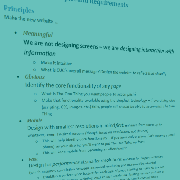
“We are not designing screens – we are designing interaction with information.”
Me
Design Principles
The new design needed to be:
Meaningful: “We are not designing screens – we are designing interaction with information“
Obvious: Identify the core functionality of any page
Mobile: Design with smallest resolutions in mind first
Fast: Design for performance at smaller resolutions
Empathetic: Conceptualize user personas and design for them
Requirements
Content: Keep only what is necessary; write for the web, i.e. brief and to the point; and create a style guide for new content.
Code: HTML5 and CSS3
Platform: WordPress.
Content
Analyzing Content
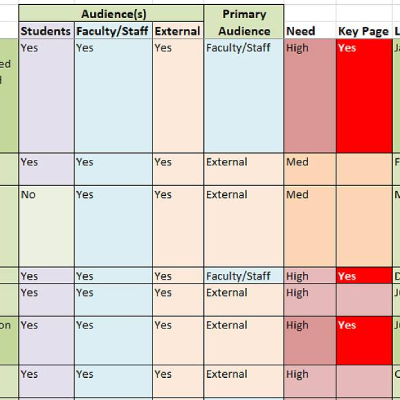
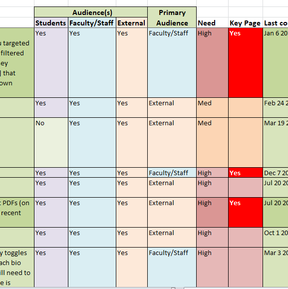
Wanting neither to keep all legacy content nor throw everything out, evaluating this content by use statistics was the first step. If a page was frequently visited it would be kept (with improvements where needed); if a page had few or no visits it would be dropped—unless it appeared that it contained important information that just wasn’t being found, in which case that content would be folded into other pages. And each page would be examined for path information (the page from which visitors reached it and the one to which they went) for clues as to why a page was popular or not.
Card Sort Data
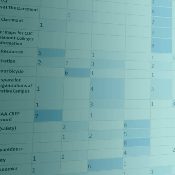
Once existing content had been winnowed and new content written (or compiled), it needed to be organized in a way meaningful to users—which made this the perfect opportunity to reach out to those users. Using the OptimalSort program from Optimal Workshop, website users were invited to categorize pages (using an online interface to sort cards under various headings) and asked related questions. Cases where all (or nearly all) respondents put a card under the same category were taken as conclusive; less conclusive cases required that user comments be used to illuminate the reasons for their choices.
Organizing the Site
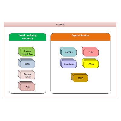
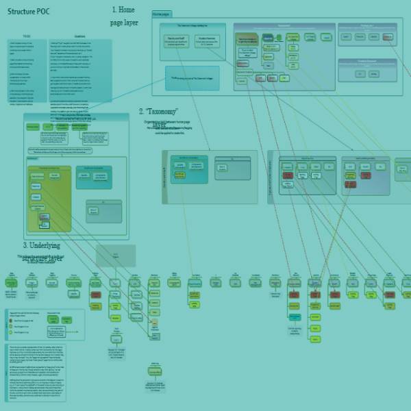
With content now in hand, how to present it to website visitors? Editing access to each department’s content needed to be limited to that department’s staff, so it made sense to structure the back end by department. Our users, however, wouldn’t always be aware of all our departments; they would be looking for specific things and wouldn’t want to hunt for them in various departmental silos. Also, different groups of users would be looking for different things, so user personas and a related taxonomy of content were needed. Finally, a home page layout was needed to funnel users to their content and address general needs of all potential visitors. I developed a Visio document showing these layers and the interrelationships among them.
UX/UI Design
Designing the Basics
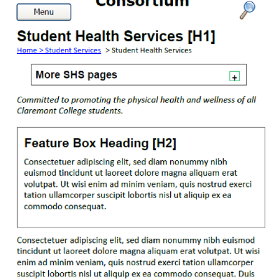
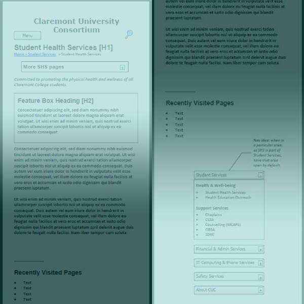
Content—check. Site organization—check. Next: designing how people will get to content (UX) and how it will be presented when they get there (UI). Two basic things not to assume: one, that people will be coming from the home page (likely as not they’ll be coming from site search or even Google); and two, that people will be using a desktop computer. Therefore, (one) the wireframe shows plenty of “scent” as to where you are and where you can go from here, and (two) I designed the mobile UI first and expanded to tablet and desktop from there.
Creating Look & Feel
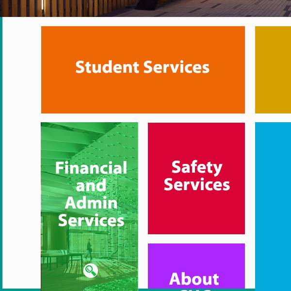
In collaboration with our graphic designer, I used InVision to prototype the look and layout of our different page types. Included in this was mocking up various behaviors, such as that of the desktop site when a user hovered over a navigational block on the home page, which replaced that block’s color with an image overlay. Once our design was set, we handed it off to our developer for coding.


Project Gallery
The redesign involved analyzing content based on traffic data and shareholder input; reorganizing content around audiences and their needs; and mocking up the new design, using wireframes to establish concepts.